The Good: Not directly related to accessibility, but positive news nonetheless — Google and Figma are bringing Figma to education chromebooks. Figma has some accessibility issues of its own, but it is an incredibly robust tool that can be used to design accessible, reusable components in design systems. When I teach the front-end website design class at Minneapolis College, I tell my students that Figma is like Google Docs for design. And have them use it to build design briefs, mood boards, and mockups as I talk about how Figma can be used to promote accessibility.
The Bad: I spend a significant amount of time listening to podcasts. Unfortunately, even many of my favorite podcasters have not invested the time to make their podcasts more accessible. It could be that they are unaware of the need to do so, or how to go about it. Recently, someone in my network shared a great resource intended to help podcasters.
Your podcast should be accessible. But what does that mean, exactly? Why should you care? What can you do to improve the accessibility?
Podcast Accessibility
The Ugly: I’m solidly GenX. When I was growing up, I would have been awed to know that one day I would have a powerful computer in my pocket — or hand — at all times. But I also recognize the inherent danger of smartphones. And now a study bears that out.
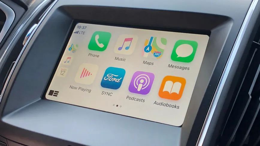
Apple CarPlay, Android Auto distract drivers more than pot, alcohol, says study: A new study says driver reaction times using this tech were worse than motorists with alcohol or cannabis in their system.
CNET Auto Tech
